Understand Paper Sizes and Weight Basics
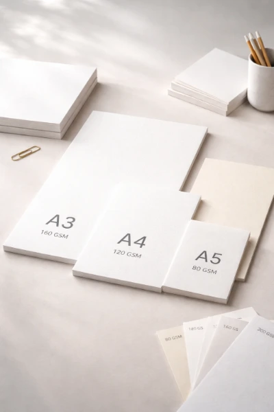
Paper size and weight influence everything from how a printed piece feels to how easily it can be mailed, folded, or displayed. Understanding the main sizing systems and common paper weights makes it much easier to choose a suitable stock before preparing a design.
The ISO 216 A Series
Most of the world uses the ISO 216 system. Each size in the A series is exactly half the one above it – fold an A3 sheet in half and you get A4. That single rule makes scaling layouts between sizes straightforward.
Here are the four sizes you will encounter most often:
A3 – 297 × 420 mm (11.7 × 16.5 in)A4 – 210 × 297 mm (8.3 × 11.7 in)A5 – 148 × 210 mm (5.8 × 8.3 in)A6 – 105 × 148 mm (4.1 × 5.8 in)
The B series sits between A sizes and is used mainly for posters and books. C series envelopes are sized to fit A sheets neatly.
US sizes do not follow this logic. Letter (8.5 × 11 in) is close to A4 but not identical. Legal runs to 14 inches long, and Tabloid matches roughly to A3.
Understanding GSM
GSM stands for grams per square meter – it measures how much one square meter of that paper weighs. Heavier GSM generally means stiffer, thicker paper, though the relationship is not perfectly linear across all paper types.
Standard office paper sits around 80 GSM. Flyers and brochures typically use 120–170 GSM. Business cards and heavy cards run from 300–450 GSM.
American buyers will see pound (lb) weights instead. Those numbers are calculated differently and cannot be converted by simple math. A 90 lb text stock is roughly 135 GSM, not 90.
Choose the Right Finish for the Look You Want
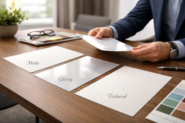
Paper finish affects appearance, texture, readability, and how well a printed item holds up to regular handling. The best choice depends on whether the priority is vivid imagery, comfortable reading, a writable surface, or a more distinctive tactile effect.
Paper Stock Finishes
Your choice of finish shapes how a printed piece feels in someone's hand before they've read a single word. Each finish behaves differently under ink, light, and handling.
Gloss stock has a shiny, reflective surface that makes colors pop. It's the go-to for marketing brochures, product catalogues, and anything where vivid imagery matters. The trade-off is that it can be harder to read under direct light and won't take pen or pencil well.
Matte stock absorbs light rather than reflecting it, giving a flat, clean look. Text reads easily, and it feels understated. Popular for reports, books, and anything with a lot of copy.
Silk sits between the two. It has a slight sheen without the glare of gloss, making it a practical all-rounder for leaflets and flyers.
Uncoated paper has no surface treatment at all. It feels natural and soft, accepts handwriting, and suits stationery, notepads, and forms.
Textured stock – linen, felt, or laid finishes – adds a tactile quality that signals premium. Think wedding invitations or high-end business cards.
Finishing Options
Lamination is a thin plastic film bonded to the printed sheet, available in matte or gloss, adding durability and a refined surface feel. Spot UV applies a glossy, raised coating to specific areas only, creating contrast against a matte background. Foiling presses a metallic or pigmented film onto the surface using heat, producing a reflective, decorative effect.
Set Up Color and Resolution Correctly for Print
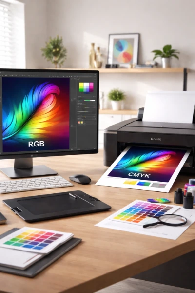
A design that looks sharp and vibrant on a monitor will not automatically produce the same result on paper. Color mode and image resolution need to be prepared for physical printing so that colors remain predictable and photographs, graphics, and text reproduce clearly.
CMYK vs. RGB: Why the Difference Matters
Your screen builds color using light – red, green, and blue combined at varying intensities. A printer works differently, laying down four ink colors: cyan, magenta, yellow, and black (CMYK). The two systems don't map perfectly onto each other.
Bright electric blues, vivid greens, and neon oranges often exist in RGB but fall outside what CMYK inks can physically reproduce. When you convert an RGB file to CMYK before printing, those colors shift – sometimes subtly, sometimes noticeably. Setting your design file to CMYK from the start gives you a more accurate preview of the final printed result.
Resolution: PPI, DPI, and the 300 Rule
PPI refers to pixel density in a digital image – how many pixels fit into one inch of the file. DPI refers to the physical dots a printer lays down per inch. Casual conversation treats them as the same thing, and for most practical purposes that's fine.
For print, 300 PPI at your final output size is the standard target. To calculate the pixel dimensions you need, multiply the print size in inches by 300. An A4 sheet at 8.27 × 11.69 inches requires an image of at least 2,481 × 3,507 pixels. Anything below 150 PPI will typically look soft or pixelated once printed.
Build Files With Bleed, Trim, and Safe Zones in Mind
Three terms cause more last-minute print errors than almost anything else: bleed, trim, and safe zone. Get these right before you send artwork, and you'll avoid the most common production headaches. Together, these measurements determine where the finished piece is cut and how close important design elements can safely sit to its edges.
Bleed
Any color, background, or image that reaches the edge of the finished piece needs to extend beyond it. That extension is the bleed – typically 3 mm (0.125 inch) on every side. Without it, the cutter can leave a thin white strip along the edge. Your file needs to be set up larger than the final size to accommodate this.
Trim
The trim line is where the cutter actually cuts. This is your finished document size – say, 210 × 297 mm for an A4 sheet. Your bleed sits outside this line; your safe zone sits inside it.
Safe Zone
Keep all text and logos at least 3–5 mm inside the trim line. Cutters shift slightly during production, so anything placed right at the edge risks being clipped.
Pre-Flight Checklist
Before uploading, run through these:
– File built to bleed size, not trim size– All background elements extended to the bleed edge– No text or logos within 3 mm of the trim line– Bleed set to 3 mm (0.125 inch) on all four sides
Good Print Results Start With the Right Specs
Knowing these fundamentals before you send a file to print saves time, money, and the frustration of receiving something that looks nothing like your screen preview. The A-series sizing system gives you a consistent, predictable framework for choosing formats. GSM tells you whether a paper will feel flimsy or substantial in someone's hands. Finishes like matte, gloss, and silk change how a design reads visually – and options like lamination or spot UV add another layer of intent. Converting your files from RGB to CMYK before print removes the guesswork around color accuracy. Setting your resolution to 300 DPI ensures images stay sharp at their final printed size. And building in the correct bleed, trim, and safe zone measurements means nothing important gets cut off. Each of these specs is straightforward once you know what it controls.